• Abfig
Platform
  • Abfig
  • Pricing
  • Journals
  • Blog
Graphical Abstract Examples That Got Published (With Analysis)
2026/06/12· Last updated 2026/07/19

Graphical Abstract Examples That Got Published (With Analysis)

Every researcher has had the experience of scrolling through a journal's latest articles and stopping on a paper — not because of the title, but because the graphical abstract caught their eye. Something about the layout, the color choice, or the clarity of the visual story made them click. That is not an accident. It is design working exactly as intended.

Studying graphical abstract examples from successfully published papers is one of the highest-return investments you can make before creating your own. It costs nothing, takes an afternoon, and teaches you more about what editors and readers respond to than any design tutorial ever will.

This article breaks down real published graphical abstract examples — analyzing what makes them effective, how they differ across journals, and what you can borrow (ethically) for your own work. No theory without evidence. Just practical patterns you can use immediately.


What Makes a Graphical Abstract Effective: The Five Pillars

Before we look at specific examples, let us define what "effective" actually means in the context of a graphical abstract. An effective graphical abstract does exactly one job: it makes a reader — often a busy PI scanning the table of contents on their phone between meetings — decide to click on your paper instead of scrolling past it.

Researchers who study scientific communication (yes, that is a real field) have identified five consistent characteristics of highly effective graphical abstracts. Every published example that performs well hits most or all of these.

Pillar 1: Instant clarity

A reader should grasp the research question and the main finding within three to five seconds of viewing your graphical abstract. This is not about dumbing down your science — it is about respecting the reader's time. If a graphical abstract requires more than a quick glance to decode, it has failed its primary function.

The best published examples achieve instant clarity through a single dominant visual element — a striking microscopy image, a simplified mechanism diagram, or a data visualization that tells the story without words. Supporting elements are visually subordinate. Nothing competes for attention.

Key Insight: "What is the one thing you want someone to remember after five seconds?" If you cannot answer that question in one sentence, your graphical abstract is trying to do too much. The published examples that get shared most on social media and cited most frequently are almost always the simplest ones.

Pillar 2: Clear visual hierarchy

Visual hierarchy is the design principle that guides a viewer's eye through information in order of importance. In a graphical abstract, this usually means: the central finding is largest and most visually prominent, supporting evidence is medium-sized and arranged around it, and contextual or methodological details are smallest and most subtle.

You can create visual hierarchy through size (bigger = more important), color (warm or saturated colors draw attention; cool or muted colors recede), position (center commands attention; edges are peripheral), and contrast (high contrast pops; low contrast fades). The best published examples use at least two of these techniques simultaneously.

Pillar 3: Purposeful color

Color in effective graphical abstracts is never decorative. It serves one of three functions: to encode meaning (red = downregulated, green = upregulated, for example), to create hierarchy (the key finding gets the most saturated color), or to establish brand/field conventions (a particular protein shown in its established color).

Most published examples that look professional use a surprisingly limited palette — often two colors plus grayscale. The restraint signals that the researcher knows what they are doing. Every additional color should earn its place by serving a specific communication purpose.

Pillar 4: Minimal, legible text

Text in a graphical abstract is for labeling, not explaining. The most effective published examples use short noun phrases — "Tumor microenvironment," "Synaptic vesicle," "CRISPR-Cas9" — rather than sentences. Full sentences belong in the text abstract.

A practical test: shrink your graphical abstract to 200 pixels wide (thumbnail size). If you cannot read the text, neither can someone browsing the journal's table of contents on their phone. Most published graphical abstracts use font sizes of at least 10–12 points for labels at full resolution, which translates to roughly 14–18 points in the working file before export.

Pillar 5: Journal-appropriate style

This pillar is often overlooked but critical. A graphical abstract that would look perfect for Nature might look wrong for an Elsevier journal, and vice versa — not because either is worse, but because each publisher's audience has different expectations.

Nature graphical abstracts tend to be highly conceptual, minimalist, and visually striking — almost poster-like. Cell graphical abstracts lean toward rich biological detail with clear mechanistic storytelling. Elsevier graphical abstracts (the wide landscape format) reward a linear, left-to-right narrative flow. Understanding these stylistic expectations and matching them is part of what separates a polished submission from one that feels slightly "off" to editors.


Anatomy of a Great Graphical Abstract: A Framework You Can Reuse

Rather than simply describing examples, let us build an analytical framework you can apply to any graphical abstract — your own or someone else's. This framework is derived from reverse-engineering dozens of published graphical abstracts across multiple journals and identifying the structural patterns that consistently appear.

The four-zone structure

Nearly every highly effective published graphical abstract can be divided into four functional zones. Not every abstract uses all four, and the spatial arrangement varies, but the underlying logic is remarkably consistent across journals.

Zone 1: The hook (top or center, 20–30% of the space). This is the attention-grabber — the visual element that makes someone stop scrolling. In a Nature graphical abstract, this might be a stylized illustration of the research system (a cell, an organ, a planetary body). In a Cell abstract, it may be a simplified diagram of the key molecular mechanism. The hook should be the largest single element and should communicate the research context without requiring text.

Zone 2: The finding (center, 30–40% of the space). This is your result — the novel discovery that justifies the paper's existence. It is usually represented as a before/after comparison, a pathway diagram with the newly discovered component highlighted, or a data visualization that shows a clear effect. This zone should contain your accent color (the 10% in the 60-30-10 color rule discussed earlier). When someone shares your paper on Twitter, this is the zone they are screenshotting.

Zone 3: The mechanism or evidence (surrounding or below, 20–30% of the space). Supporting details that add credibility without competing with the main finding. Microscopy images, structural diagrams, or simplified graphs belong here. The key is that these elements should be noticeably smaller and more muted than the finding — they support the story, they do not tell it.

Zone 4: The takeaway (bottom or rightmost, 10–15% of the space). A one-line implication — what your finding means for the field. "New therapeutic target identified," "Revised model of synaptic plasticity," "First structural evidence for proposed mechanism." Many researchers skip this zone entirely, which is a missed opportunity. The takeaway is what a reader remembers after the details have faded. It is also the element most likely to be quoted or paraphrased when someone references your paper.

A published example mapped to the framework

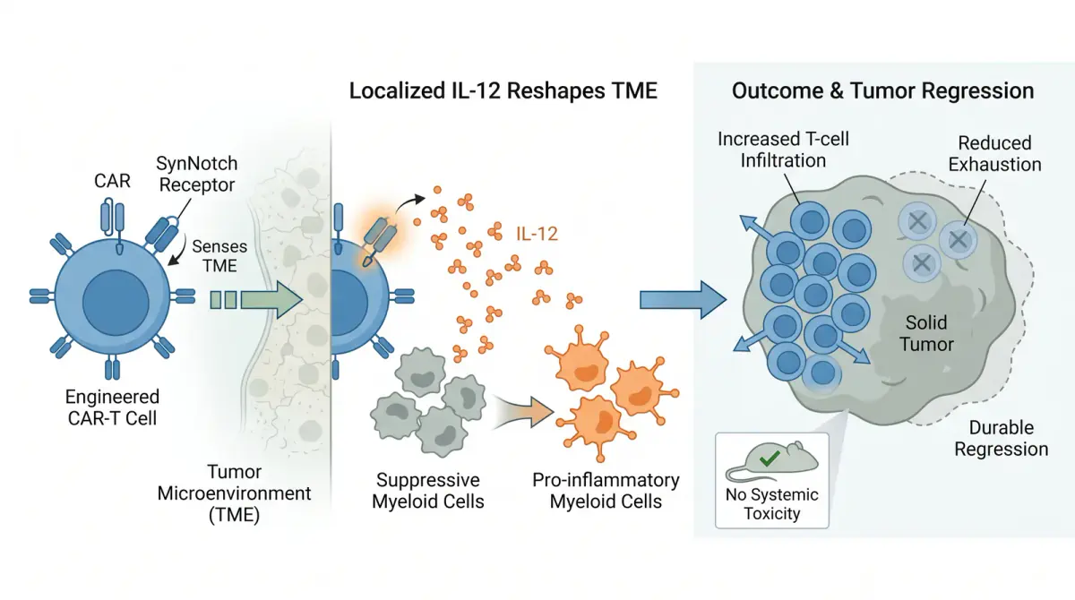
Consider a typical Cell graphical abstract that features a newly discovered signaling pathway in cancer. The hook (Zone 1) is a stylized tumor microenvironment illustration occupying the top third. The finding (Zone 2) is the pathway diagram in the center, with the newly identified kinase highlighted in the accent color. The evidence (Zone 3) consists of two small inset panels — a western blot showing knockdown efficiency and a tumor growth curve — tucked into the bottom corners. The takeaway (Zone 4) is a single line at the bottom: "Kinase X is required for immune evasion in colorectal cancer."

Every element has a job. Nothing is decorative. A reader can scan from top to bottom in under five seconds and walk away knowing: (1) this is about cancer, (2) the authors found a new kinase, (3) they have experimental evidence, and (4) it matters because it explains immune evasion. That is a graphical abstract doing its job perfectly.


Journal-Specific Style Comparison: Nature, Cell, and Elsevier

One of the most instructive exercises you can do is to open the latest issues of Nature, Cell, and a major Elsevier journal side by side and compare their graphical abstracts. The differences are not random — they reflect each journal's brand, audience, and editorial philosophy.

Nature graphical abstracts: Conceptual and restrained

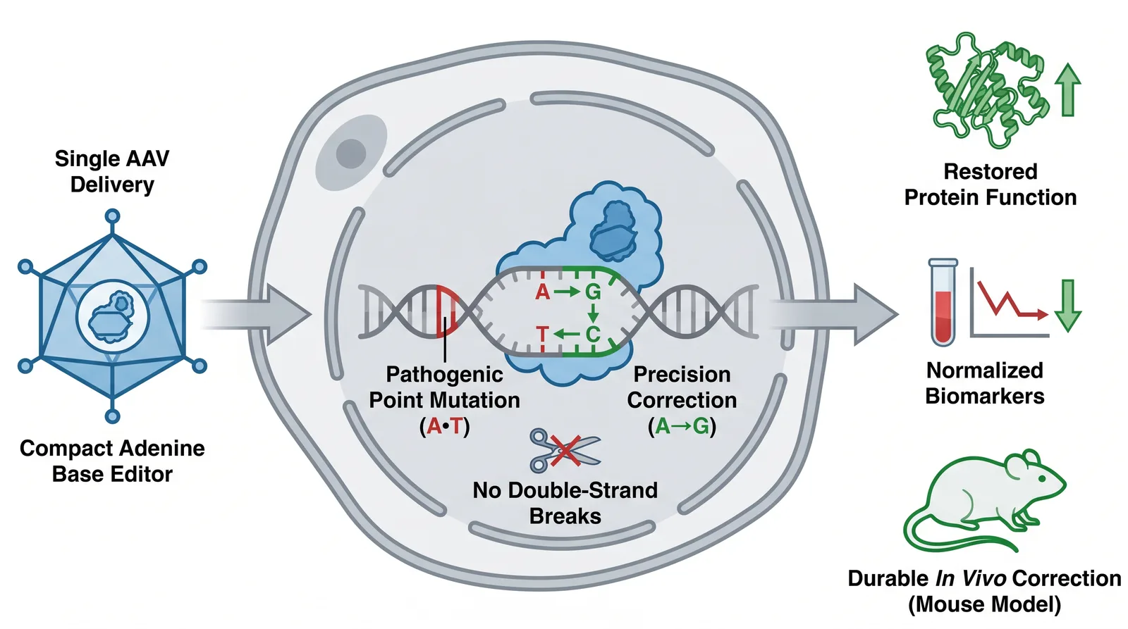
Nature's graphical abstracts tend toward minimalism. Landscape format (about 90 × 50 mm), limited color palettes (often monochromatic with one accent color), and conceptual illustrations rather than literal data representations. A Nature graphical abstract rarely includes actual data plots or microscopy images — it favors simplified, almost iconographic representations of the research system.

Why? Nature's audience spans all of science. A graphical abstract that relies on field-specific visual conventions (like a western blot or a FACS plot) would be illegible to a physicist or an ecologist browsing the same issue. Nature abstracts communicate relevance across disciplines. The style is closer to scientific illustration than to data presentation.

Key Insight: If you are submitting to Nature, ask yourself: "Would a researcher in a completely different field understand the significance of this image in five seconds?" If the answer is no, simplify further. Nature editors evaluate graphical abstracts partly on cross-disciplinary accessibility.

Cell graphical abstracts: Mechanistic and detailed

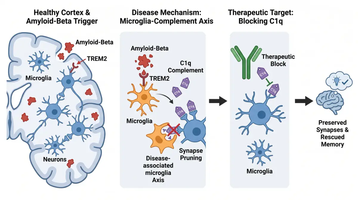
Cell graphical abstracts embrace biological complexity. Where Nature goes for conceptual minimalism, Cell allows — and arguably expects — mechanistic detail. A typical Cell graphical abstract might show a multi-step signaling cascade, a cellular process with multiple stages, or a structural model with several interacting components.

The square format (minimum 1200 × 1200 pixels) gives enough canvas for this detail. Color is used generously but purposefully — different proteins in a pathway are consistently color-coded, cellular compartments are visually distinct, and the novel finding is highlighted through color contrast. Cell expects its readers to be biologists, so field-specific visual language is not just acceptable — it is the norm.

Elsevier graphical abstracts: Narrative and sequential

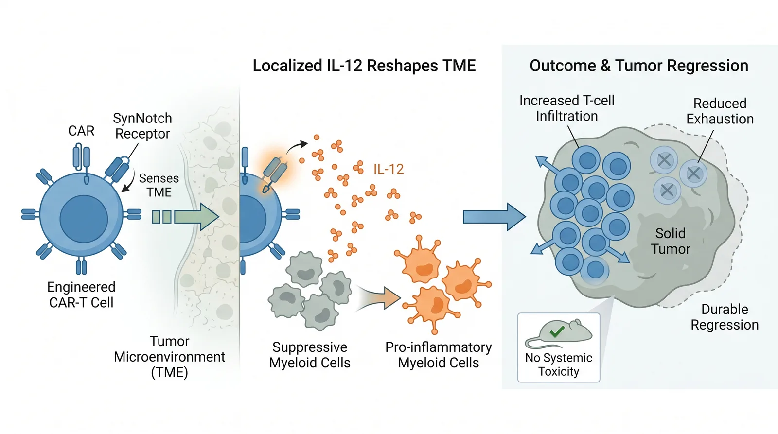
Elsevier's wide landscape format (typically 1328 × 531 pixels, roughly a 2.5:1 ratio) naturally encourages a left-to-right narrative flow. This is arguably one of the easiest formats for telling a sequential story: background context on the left, methodology or approach next, key finding after that, and implications on the right.

Read left to right, it works like a visual abstract in the literal sense — it mirrors the structure of a text abstract translated into images. This makes it forgiving for researchers who are new to graphical abstract design because the narrative structure is built into the format. The risk is overcrowding: the temptation to fill the horizontal space with too many elements is strong. The best Elsevier graphical abstracts maintain generous white space between sections and let the story breathe.


Before and After: Common Design Mistakes Fixed

The fastest way to internalize what works is to see design problems and their solutions side by side. Here are three common graphical abstract mistakes — based on real patterns seen in rejected or revised submissions — and how to fix them.

Mistake 1: The "wall of panels" (fixed with hierarchy)

Before: A graphical abstract that is essentially a 3×3 grid of equally sized panels, each containing a different figure from the paper — a microscopy image, a bar chart, a pathway diagram, a western blot, a survival curve, and so on. All panels are the same size, same border, same visual weight. The reader has no idea where to look first.

After: One panel is enlarged to occupy 50% of the canvas — this is the main finding. The remaining panels are reduced to 25% of their original size and arranged as supporting evidence in the lower third. A visual flow (arrows or numbered steps) connects them. The reader now sees one story, not nine competing panels.

This fix alone — choosing one dominant visual and demoting everything else to supporting status — is the single highest-impact change most researchers can make to their graphical abstract.

Mistake 2: The "rainbow explosion" (fixed with restraint)

Before: A graphical abstract using six different colors — red, blue, green, yellow, orange, and purple — to distinguish different elements. Each color is fully saturated. The result looks like a packet of candy, not a scientific figure, and the reader's eye bounces chaotically between equally loud elements.

After: The palette is reduced to one primary color (a muted blue), one accent color (a warm orange used only for the novel finding), and grayscale for everything else. The overall impression is calm, professional, and — most importantly — the reader's eye goes straight to the orange element, which is exactly what the researcher wants.

Most researchers are surprised by how much more professional their work looks with fewer, more muted colors. If you are unsure, start with grayscale and add color only where it serves a specific communication purpose.

Mistake 3: The "paragraph in a picture" (fixed with reduction)

Before: A graphical abstract with five text blocks, each containing 2–3 full sentences. At full size, the text is readable. At thumbnail size — the size at which most readers will first encounter it — the text is a gray blur.

After: Each text block is reduced to 2–5 words. Sentences become labels. Explanatory text is removed entirely — that information lives in the text abstract. The resulting graphical abstract is cleaner, more scannable, and communicates more effectively because the visual elements are no longer competing with dense text.

A useful exercise: remove all text from your graphical abstract. Can a colleague in your field still describe what your paper is about? If yes, your visual communication is solid. Add back only the minimum text needed for precision — gene names, protein names, condition labels.


How to Reverse-Engineer a Great Graphical Abstract for Your Own Paper

The most practical way to use published graphical abstract examples is not to copy them — that would be plagiarism, and it would not fit your research anyway — but to reverse-engineer their design decisions and apply the same principles to your own work.

Step 1: Build a swipe file

Spend 30 minutes collecting 10–15 graphical abstracts from your target journal that you find visually compelling. Save screenshots. These are not templates to copy — they are reference points for "what good looks like" in your field and target journal.

Step 2: Analyze each one systematically

For each example in your swipe file, answer these five questions:

  1. What is the single most visually dominant element? (The hook — Zone 1 in our framework)
  2. How many distinct colors are used? (Almost always 2–3 plus grayscale)
  3. What is the approximate text-to-visual ratio? (Most effective examples are 80%+ visual by area)
  4. How is the content organized spatially? (Top-to-bottom? Center-out? Left-to-right?)
  5. What convention does this journal use that differs from others? (Square vs. wide landscape, conceptual vs. mechanistic, etc.)

Step 3: Extract reusable patterns, not specific designs

After analyzing your examples, patterns will emerge. You might notice that Nature abstracts in your field consistently use a central circular motif. Or that Elsevier abstracts in your subdiscipline almost always place the context at the top and the takeaway at the bottom. These are conventions — unwritten rules that you can follow without copying anyone's specific work.

Step 4: Apply the patterns to a journal-sized draft

This is where you translate analysis into action. Whatever you build in, start from your target journal's exact size and resolution — a tool like Abfig sizes the output to Nature, Cell, Elsevier, or ACS automatically. Then bring in the visual patterns you identified: if your target journal favors minimalist, conceptual illustrations, describe a composition with open space and a single large central element; if it favors mechanistic detail, describe structured pathways and clearly separated regions.

The journal preset gives you the technical fit (dimensions and resolution). The patterns you extracted from published examples give you the stylistic fit. Together, they produce a graphical abstract that looks like it belongs in your target journal.


The Role of AI in Learning from Examples

AI has changed how quickly a non-designer can produce a graphical abstract. Instead of building one element by element, you can describe your finding — or hand over a rough sketch — and a tool like Abfig generates a complete figure sized to your journal. The value of studying published examples is that it tells you what to ask for: which layout pattern fits your story, how much text belongs in the frame, where the emphasis should sit.

This is not AI replacing researcher judgment. It is AI handling the drawing and the sizing so you can focus on the science. You remain in control of your story — and responsible for checking the result: an AI-generated figure is a draft, and some journals require you to disclose AI use or do not accept AI-generated figures at all, so confirm your target journal's policy before submitting.


Frequently Asked Questions

Where can I find good graphical abstract examples?

The best source is the table of contents page of your target journal's most recent issues. Nature, Cell, and most Elsevier journals display graphical abstracts alongside article titles in their online ToC. Additional sources include journal social media accounts (where graphical abstracts are often shared as standalone images), PubMed results pages, and scientific illustration portfolios on platforms like Behance or Dribbble.

What makes a graphical abstract get published in Nature?

Nature prioritizes conceptual clarity, cross-disciplinary accessibility, and visual impact. The best Nature graphical abstracts communicate their finding to a broad scientific audience using minimalist designs, restrained color palettes, and conceptual (rather than data-heavy) visual approaches. They also match Nature's format (about 90 × 50 mm, landscape) at 300 dpi.

Can I reuse elements from published graphical abstracts?

You can absolutely adopt the design principles and structural patterns — that is learning. You should never copy a specific illustration, layout, or visual element from someone else's work — that is plagiarism. The ethical approach is to study what works, extract the underlying principles, and apply those principles to your own unique content.

How different should my graphical abstract look for different journals?

Significantly different. A graphical abstract submitted to Nature should not look like it was designed for an Elsevier journal, and vice versa. Each major publisher has distinct format requirements (square vs. wide landscape), aesthetic conventions (conceptual vs. data-forward), and audience expectations (broad vs. specialist). Tailoring your graphical abstract to your target journal demonstrates professionalism and increases the likelihood of editorial acceptance.

What if I have no design sense at all?

That describes most working researchers. Design sense is largely pattern recognition, which you build by studying published examples — exactly what this guide walks you through. Specialized tools like Abfig further lower the barrier by generating a journal-sized figure from your abstract or sketch, so you start from something concrete rather than a blank canvas. You do not need to become a designer. You need to recognize what works in your field and describe it.


Want to see these principles in action? Abfig turns your abstract or sketch into a graphical abstract sized for Nature, Cell, Elsevier, or ACS — a fast way to get a concrete draft you can refine. Try Abfig free →

Related guides

  • How to make a graphical abstract
  • Visual abstract vs graphical abstract — same concept, different field
  • Journal specifications: Nature · Cell · Elsevier
  • Browse all journal specifications

Make your own graphical abstract in Abfig →

Create your own graphical abstract

Paste your paper abstract and Abfig drafts a journal-sized figure, sized for your target journal.

Open the graphical abstract makerGraphical Abstract Maker →
All Posts

Table of Contents

  • What Makes a Graphical Abstract Effective: The Five Pillars
  • Pillar 1: Instant clarity
  • Pillar 2: Clear visual hierarchy
  • Pillar 3: Purposeful color
  • Pillar 4: Minimal, legible text
  • Pillar 5: Journal-appropriate style
  • Anatomy of a Great Graphical Abstract: A Framework You Can Reuse
  • The four-zone structure
  • A published example mapped to the framework
  • Journal-Specific Style Comparison: Nature, Cell, and Elsevier
  • Nature graphical abstracts: Conceptual and restrained
  • Cell graphical abstracts: Mechanistic and detailed
  • Elsevier graphical abstracts: Narrative and sequential
  • Before and After: Common Design Mistakes Fixed
  • Mistake 1: The "wall of panels" (fixed with hierarchy)
  • Mistake 2: The "rainbow explosion" (fixed with restraint)
  • Mistake 3: The "paragraph in a picture" (fixed with reduction)
  • How to Reverse-Engineer a Great Graphical Abstract for Your Own Paper
  • Step 1: Build a swipe file
  • Step 2: Analyze each one systematically
  • Step 3: Extract reusable patterns, not specific designs
  • Step 4: Apply the patterns to a journal-sized draft
  • The Role of AI in Learning from Examples
  • Frequently Asked Questions
  • Related guides

Author

A
Abfig TeamWe help researchers draft graphical abstracts with AI and size them to each journal's specifications.

Categories

Journal Guides

Tags

Graphical Abstract

More Posts

How to Make a Graphical Abstract in PowerPoint (+ a Faster Way)
Journal Guides

How to Make a Graphical Abstract in PowerPoint (+ a Faster Way)

A step-by-step method for building a graphical abstract in PowerPoint, the export settings that meet journal rules, and where a dedicated tool saves time.

Abfig Team
2026/06/24
TIFF vs PNG for Graphical Abstracts: Which Format Should You Export?
Journal Guides

TIFF vs PNG for Graphical Abstracts: Which Format Should You Export?

TIFF is safest for final journal submission; PNG is ideal for web and previews. When to use each, the DPI myth explained, and what to do if your journal wants EPS or PDF.

Abfig Team
2026/07/04
Elsevier Graphical Abstract Guidelines: Size, DPI & Template
Journal Guides

Elsevier Graphical Abstract Guidelines: Size, DPI & Template

The exact size, resolution, and format Elsevier journals want for a graphical abstract — plus how to make one fast.

Abfig Team
2026/07/04
Abfig

Create graphical abstracts matched to your target journal in minutes. Built for researchers, no design skills needed.

[email protected]
Email
Abfig - Featured on Startup Fame

© 2026 Abfig All Rights Reserved.

Links
  • Features
  • Pricing
  • Changelog
  • By a Human
  • Contact
Resources
  • Journal Specs
  • Graphical Abstract Templates
  • DPI Checker
  • Visual Abstract
  • Abfig vs BioRender
  • Blog
  • Changelog
Legal
  • Privacy Policy
  • Terms of Service
  • Refund Policy
  • Cookie Policy