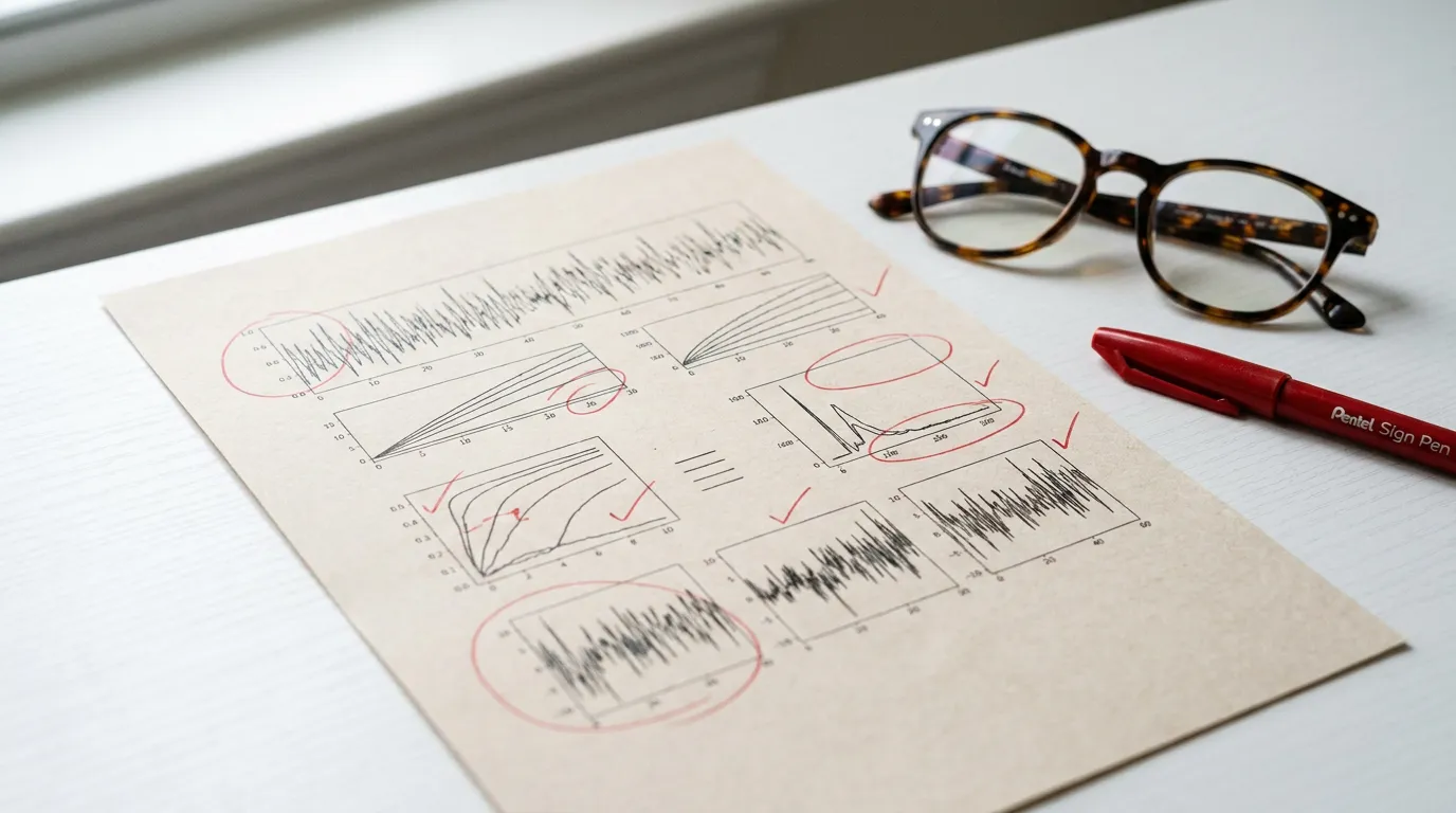
Why Was Your Graphical Abstract Returned? 7 Checks
Open the return message beside the exported file. If the editor names a size, format or readability problem, start there. Use the checks below for anything the message leaves unclear.
1. Dimensions or aspect ratio
Compare the actual canvas with the exact journal's current size and aspect ratio. Do not reuse a square or wide preset across unrelated titles.
2. Resolution
Check the required resolution for the artwork type and final physical size. Different journals—and sometimes different line, grayscale, and color artwork—can use different thresholds. Inspect the exported pixels with the DPI checker.
3. Text legibility
View the image at the size where readers will encounter it. Increase small labels, reduce long sentences, and check that symbols remain distinct.
4. File format and color
Use a file type and color mode named by the exact journal. TIFF, PNG, JPEG, EPS, and PDF are not interchangeable in every workflow.
5. Visual density
Remove secondary detail that competes with the main scientific message. White space and grouping should make the reading order clear.
6. Rights and attribution
Verify that you own or may reuse every icon, logo, photograph, and figure element. Follow the journal's permissions and attribution instructions.
7. Scientific focus
Check that the image represents the manuscript's actual findings and does not add unsupported mechanisms, labels, or outcomes.
Keep a technical correction record
Record the exported file type, pixel width and height, intended physical size, resolution metadata, color mode, and whether labels remain readable at that final size. For a raster image, width in inches equals pixel width divided by pixels per inch: 1328 pixels at 300 ppi is approximately 4.43 inches. Changing only a resolution tag does not add pixels or recreate illegible lettering. This arithmetic example is not a universal journal size. The Elsevier artwork sizing instructions distinguish artwork type and resolution; follow the exact journal and artifact requirements before resampling or converting. Use the file dimensions and DPI checker to inspect the exported file, then compare it with the return message.
Before resubmitting
- Read the exact return message.
- Compare every technical field with the current journal page.
- Recheck scientific accuracy and rights.
- Inspect the final exported file.
Correcting these items reduces avoidable ambiguity but does not guarantee editorial or production acceptance.
Review the journal policy first
Check the official journal guidance before using AI-generated imagery. If the policy is restrictive or unclear, do not submit an AI-generated figure.
Table of Contents
Author
Categories
Tags
More Posts
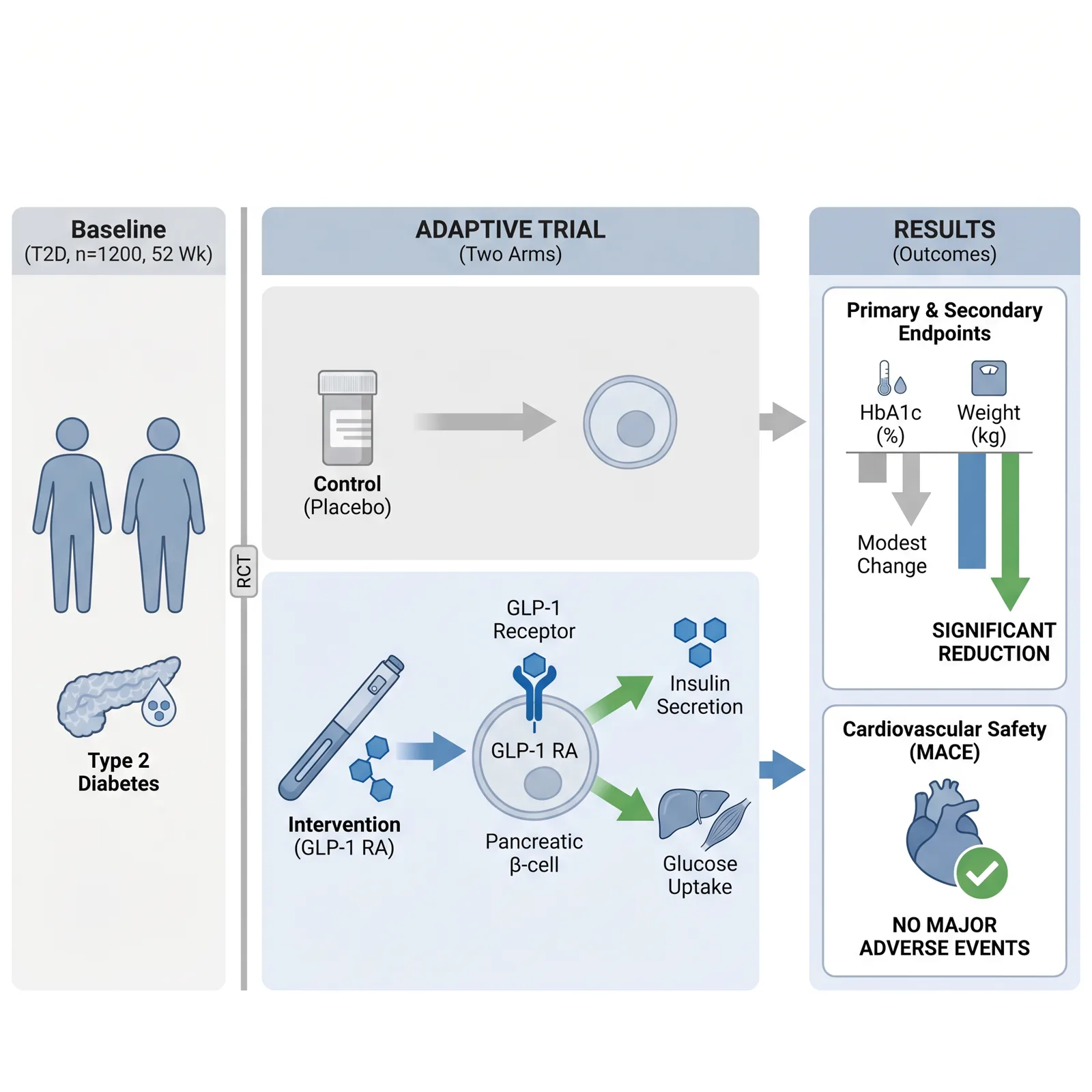
Visual Abstract vs Graphical Abstract: Check the Journal
Visual abstract and graphical abstract overlap, but they are not guaranteed to be the same deliverable. Follow the exact journal definition.
Can You Use AI to Make a Graphical Abstract? How to Check
AI-image policies differ by publisher, journal, image type, and intended use. Use the official links and verify the exact rule before submission.
Frontiers Graphical Abstract Guidance: Check the Journal First
The general Frontiers author guide does not define one standalone graphical abstract specification. Check the exact journal page and current figure rules.