Graphical Abstract Layout Structures: Which One Fits Your Research
Three useful layout structures
Flow, central-figure, and comparison layouts are three useful starting points for different scientific stories. Choosing a structure before adding detail can make the reading order easier to test. These are design patterns, not software features — they work whether you draw the figure in Illustrator, Inkscape, PowerPoint, or generate a first draft with AI. The question is which shape matches your paper.
1. The flow layout — for a sequence
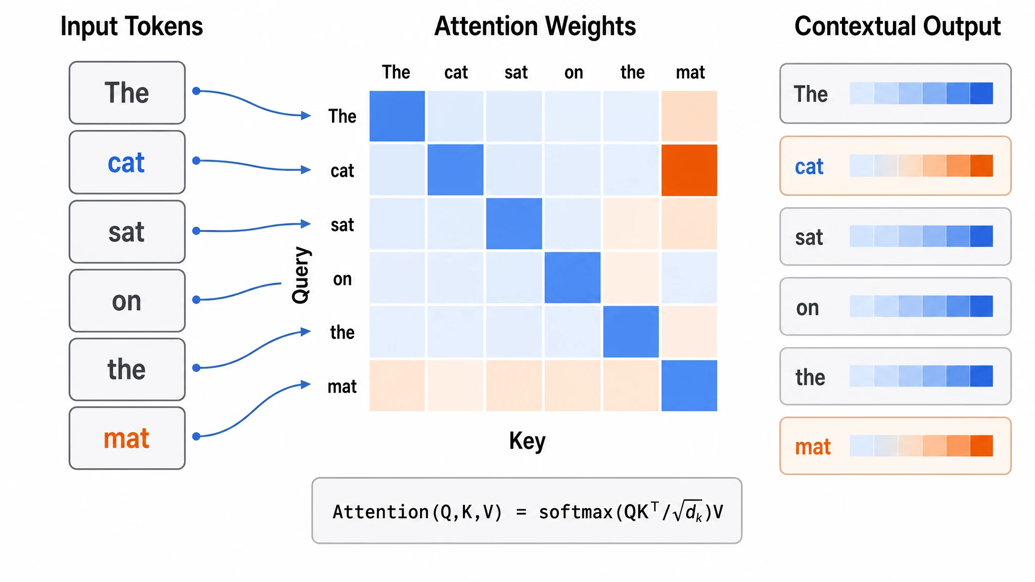
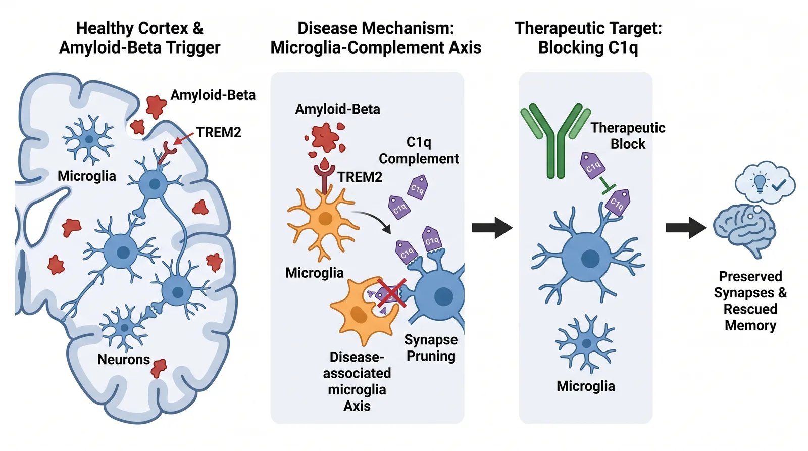
A flow layout arranges elements in a directional sequence, left to right or top to bottom. It suits process narratives: signaling cascades, metabolic pathways, experimental protocols, drug mechanism-of-action diagrams.
If your paper answers "what happens first, then next, then after that," a flow structure fits. Each step gets its own panel, with short labels connecting them into one continuous sequence rather than disconnected captions.
Example use cases:
- A kinase cascade where each phosphorylation step needs its own panel
- A drug-delivery timeline: nanoparticle uptake → endosomal escape → payload release → target engagement
- An experimental design with sequential stages
2. The central-figure layout — for a hierarchy
A central-figure layout places one large visual in the middle, surrounded by smaller supporting elements. It suits hierarchical narratives: a key finding or model presented first, with evidence and context arranged around it.
If your paper has one central result that everything else supports — a structure, a model, a core observation — this structure frames it naturally. The center holds the primary visual (a crystal structure, a proposed model, a key micrograph); the surrounding space holds validation experiments, controls, or quantification.
Example use cases:
- A cryo-EM structure as the centerpiece, surrounded by functional assays and mutational analysis
- A proposed mechanism in the center, with experimental evidence in peripheral panels
- A core phenotype flanked by genetic and pharmacological validation
3. The comparison layout — for categories
A comparison layout gives each condition, group, or treatment its own distinct visual space, often radiating from or aligned against a shared reference. It suits categorization narratives: comparisons, classifications, multi-condition experiments.
If your paper compares multiple conditions, a comparison structure lets a reader scan the differences at a glance. A shared element — a pathway, a cell type, a model system — anchors the common context, and each category branches out from it.
Example use cases:
- Wild-type vs. three mutant variants compared across a shared readout
- Drug-screen results organized by mechanism class
- Multi-tissue expression analysis with a shared gene model at the center
How to decide
Ask one question: what is the shape of your main story?
- A sequence → flow layout.
- A hierarchy → central-figure layout.
- A comparison → comparison layout.
If two could work, sketch both roughly and compare them at thumbnail size. Keep the version with the clearer reading order.
Turning a structure into a figure
Once you know the structure, you still have to draw it. If you would rather not start from a blank canvas, Abfig generates a complete raster draft from abstract text or a rough sketch. Describe the arrangement or upload a structural sketch, use Refine if the whole layout needs to be redrawn, and use Inpaint if one brushed area needs a local redraw. The result is not an object-based vector file: review it for scientific accuracy, confirm the available export format, and check the current image policy for your target journal.
Related guides
Review the journal policy first
Check the official journal guidance before using AI-generated imagery. If the policy is restrictive or unclear, do not submit an AI-generated figure.
Table of Contents
Author
Categories
Tags
More Posts
Nature Graphical Abstracts: Journal-Specific Requirements
Nature Portfolio has no single graphical-abstract rule. Compare Nature Communications and Nature Chemical Biology, then check the exact title.

Elsevier Graphical Abstract Guidelines: Size, Format & Workflow
Elsevier recommends a minimum 1328 × 531 px graphical abstract at 300 dpi. Check the current preferred formats and your journal-specific instructions.

Does PLOS ONE Require a Graphical Abstract? Current Guidance
PLOS ONE does not describe a separate graphical abstract submission. Learn what its optional Striking Image is and where to verify current figure rules.